Important things to consider when designing a logo
The main reason I love graphic design so much is because it mixes psychology and art (two of my favorite things). You’re using creativity to communicate a certain message or feeling to your audience… and sometimes your even doing it without words. Psychology is a super important factor in successful branding. This can sometimes feel like a difficult task, since you may think a logo needs to convey meaning right off the bat.
One of my favorite examples is the Nike swoosh. The swoosh on it’s own, without context, conveys energy & movement… but what else does it say? Nike started off by building an amazing and memorable brand by providing durable and effective footwear built FOR athletes BY athletes. Over the years, they transformed from a footwear company to an active-life company. Now offering apparel, water bottles, backpacks, hats, etc. Nike continued to push boundaries with cutting-edge products and strategic marketing campaigns, signing endorsement deals with legendary athletes like Michael Jordan and Tiger Woods. Today, Nike is not only a powerhouse in the sports world but also a cultural icon, inspiring athletes and enthusiasts around the globe with its commitment to innovation, performance, and excellence.
So why is the Nike swoosh so important? Because it’s known as being one of the most iconic and best logos ever created. If their logo started off as a shoe because they were a footwear company it wouldn’t have held up as well over the last 50 plus years and they likely would have gone through a rebrand (or several) since. The swoosh is dynamic but doesn’t necessary say… we create active-wear! But we are now programed, after years of exposure to the brand, to think certain things or feel a certain way whenever we see that swoosh.
In this blog post, I’ll be talking about some important elements in logo design and how they are used to pull your audience in. In turn, creating brand loyalty and generating more revenue for your company. However, if Nike created shoes that fell apart after one of their athletes races they wouldn’t be as successful as they are today. It doesn’t matter how amazing a brand’s logos is if the product, services, or brands story falls flat. A logo is meant to be a visual representation so that your clients or potential clients recognize you or your product. It’s there to compliment the essence and values of the brand. Below are some important things to consider during the logo designing thought process.
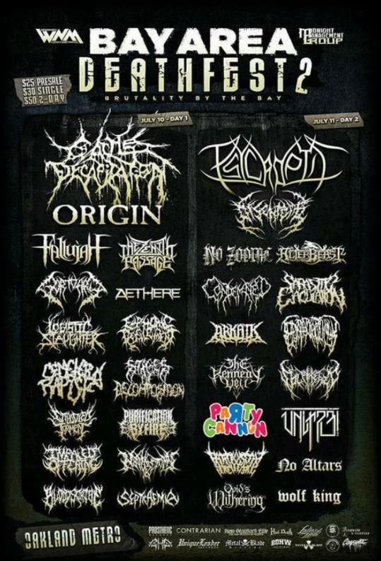
Brand Differentiation: What makes your brand or logo stand out in a crowded place? A unique logo helps a brand stand out from the competition. By conveying unique traits and characteristics, a logo distinguishes one brand from another, which helps with brand recognition and creating loyalty among customers. Check out this Death Metal concert poster to the right… not sure if I could find a better example of this concept!
Communication: What do people think or feel when they look at your logo or branding? The job of a great logo is to communicate messages about a brand. Including your brand’s: identity, values, or possibly what products and/or services you provide. That’s why choosing the right elements, colors, fonts, and imagery, are so important. You want to make sure those things align with your demographic or your desired demographic.
Professionalism and Trust: A solid logo enhances the credibility of a brand, business, or organization. When you have a logo that looks like it was created by a professional, that is clean and well put together, it will put your clients mind to ease that your brand is reputable and trustworthy.
Versatility: Logos get used across a bunch of different platforms. Physical marketing; promotional products, business cards, packaging, signage, staff uniforms, basically any physicals materials. And digital media; websites, videos, social media, etc. A logo that can be used across all platforms consistently, ensures that the brand maintains cohesive visual identity across different channels and formats.
Memorability: Can you draw the Nike swoosh without looking at a reference? The ultimate goal is having a memorable logo. That way your clients can recognize your brand, packaging, product, or services upon making their buying decisions. Have you ever stood in the aisle in a grocery store looking for your favorite (insert food or beverage) for what feels like forever, only to realize they changed the look of the packaging…? I know I have and it can be super annoying. But it’s why consistency in branding is so important. If you’re going through a rebrand, it’d be a good idea to consider sticking with the certain elements that are the same from your past packing. Even if Coca-Cola updates their logo or can design you probably know to look for a certain shade of red on the shelves.
There are many more things that come into play when designing a logo outside of what I have mentioned (or briefly touched on) in this blog. For example: symbolism, balance, legibility, color, demographic, the list goes on. I hope this post was helpful if you’re looking for some quick tidbits to consider for a rebrand, starting a new business, or you’re just a fellow graphic design/psychology nerd like me. If you liked this post, you may be interested in our blog post about using color in your branding.

