Colors in Design
Color is an extremely important element in branding and logo design. Keeping your color palette consistent is critical so that your audience gains brand recognition. If your brand colors vary too much it will be hard to gain any recognition, which could negatively impact sales, and could even make your brand appear disorganized or unprofessional. That’s why brand guides are so amazing… they state all your brands’ colors and keep consistency across all platforms. Brand guides will also come in handy when creating employee uniforms or branded merchandise.
Here’s a helpful color guide to consider if you’re thinking about rebranding or starting a new business.
There are four popular color types are — CMYK, PANTONE, HEX & RGB . These all fall into one of the two basic categories. CMYK & PANTONE are for print. HEX & RGB are for onscreen.
CMYK - Also known as four color process or full color. CMYK stands for Cyan, Magenta, Yellow, and Black. An easy way to remember this is to think of the standard printer ink cartridges your computer uses. This process in commonly used in printed paper products, like flyers, posters, business cards, etc. It involves different combinations of large and small transparent dots that overlap each to create a wide spectrum of colors.
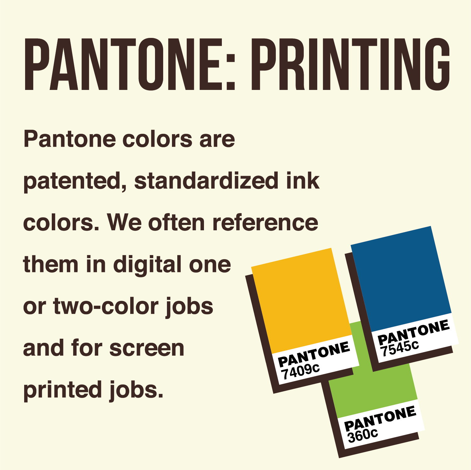
PANTONE - Also known as spot colors or PMS colors. PMS stands for pantone matching system. Pantone colors are patented, standardized ink colors. They are often used in one or two-color jobs and screen-printed goods. Every shade is mixed according to a unique mixing formula developed by Pantone. We reference Pantone Coated colors a lot because they help both our printers and designers specify and control the colors for projects.
HEX - HEX is short for hexadecimal color and is specifically used for web design. A HEX color is expressed as a six digit combination of numbers and letters defined by its mix of red, green and blue.
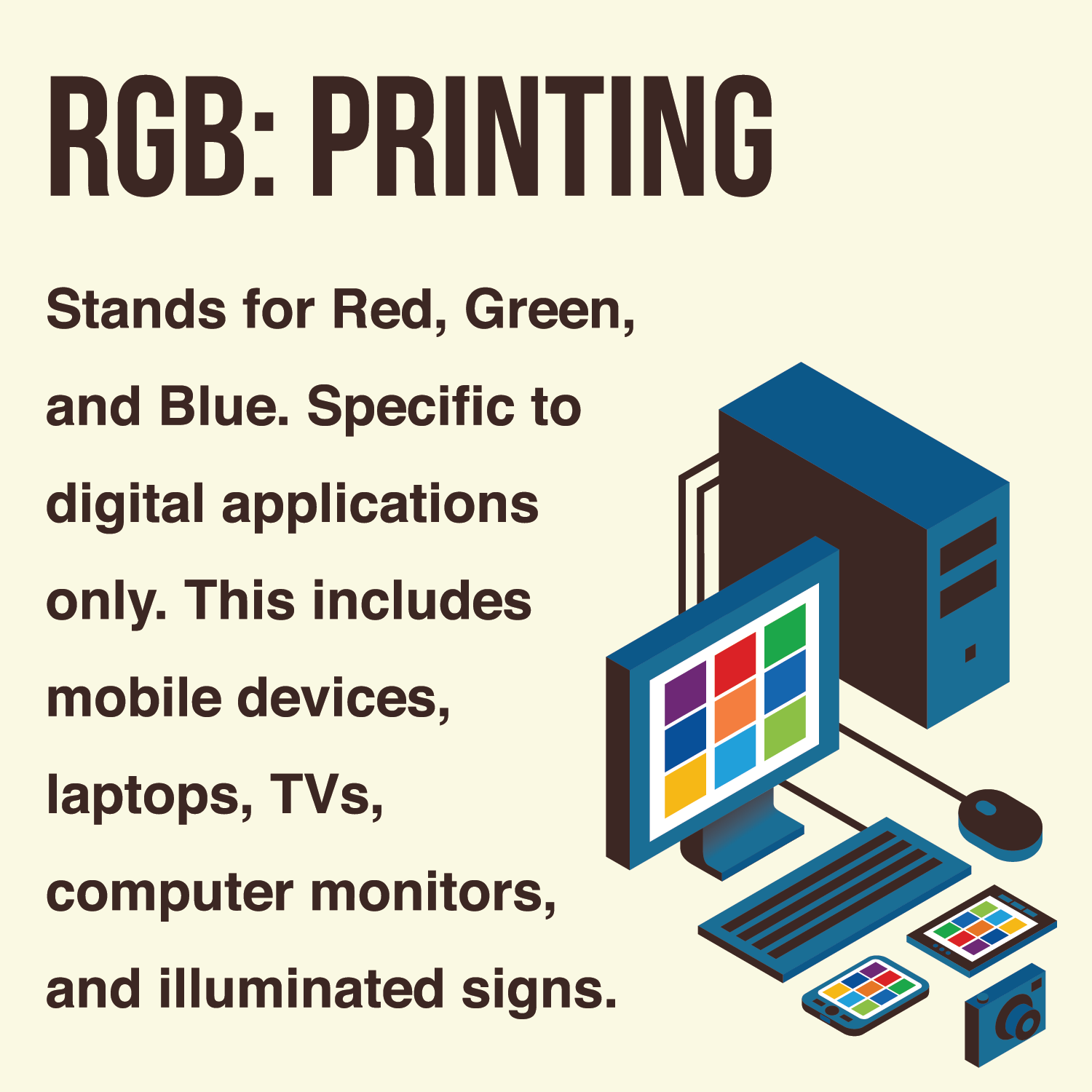
RGB - This process renders onscreen by using combinations of red, green, and blue. RGB is specific to digital applications only. This includes mobile devices, computer monitors, laptops, TV and movie screens, games, and illuminated signs. You may hear of people who design something in RGB and then get disappointed when the finished printed piece is less vibrant. That is because RGB colors appear vibrant because they are illuminated and there is a larger range in color than what you’d get on the printed piece of paper.
It's best practice to keep your brands’ colors consistent, whether you’re posting on social media platforms or incorporating those colors into a company uniform. Think about it this way, if your main brand colors are blue and red but all of your staff are wearing yellow at an event, it doesn’t really strengthen your brand recognition and it may even seem a little confusing to your audience. It’s important to make a memorable impact through your brand colors especially when you or your employees are face to face with clients or potential clients.


